WORKING LANGUAGE →
Nederlands ✺ english
CONTRIBUTED WITH
Layout
Illustration
Motion


Summary
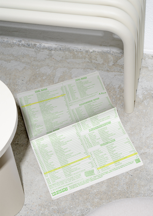
Manus magazine is a printed A4 publication accompanied by a calendar of upcoming workshops and a specially illustrated poster. Each issue offers an overview of creative projects from the Aalst region in Belgium, offering readers a curated selection of workshops, lectures, and exhibitions. The magazine serves as a platform to share their work and connect with the community, fostering a vibrant cultural scene.
Design
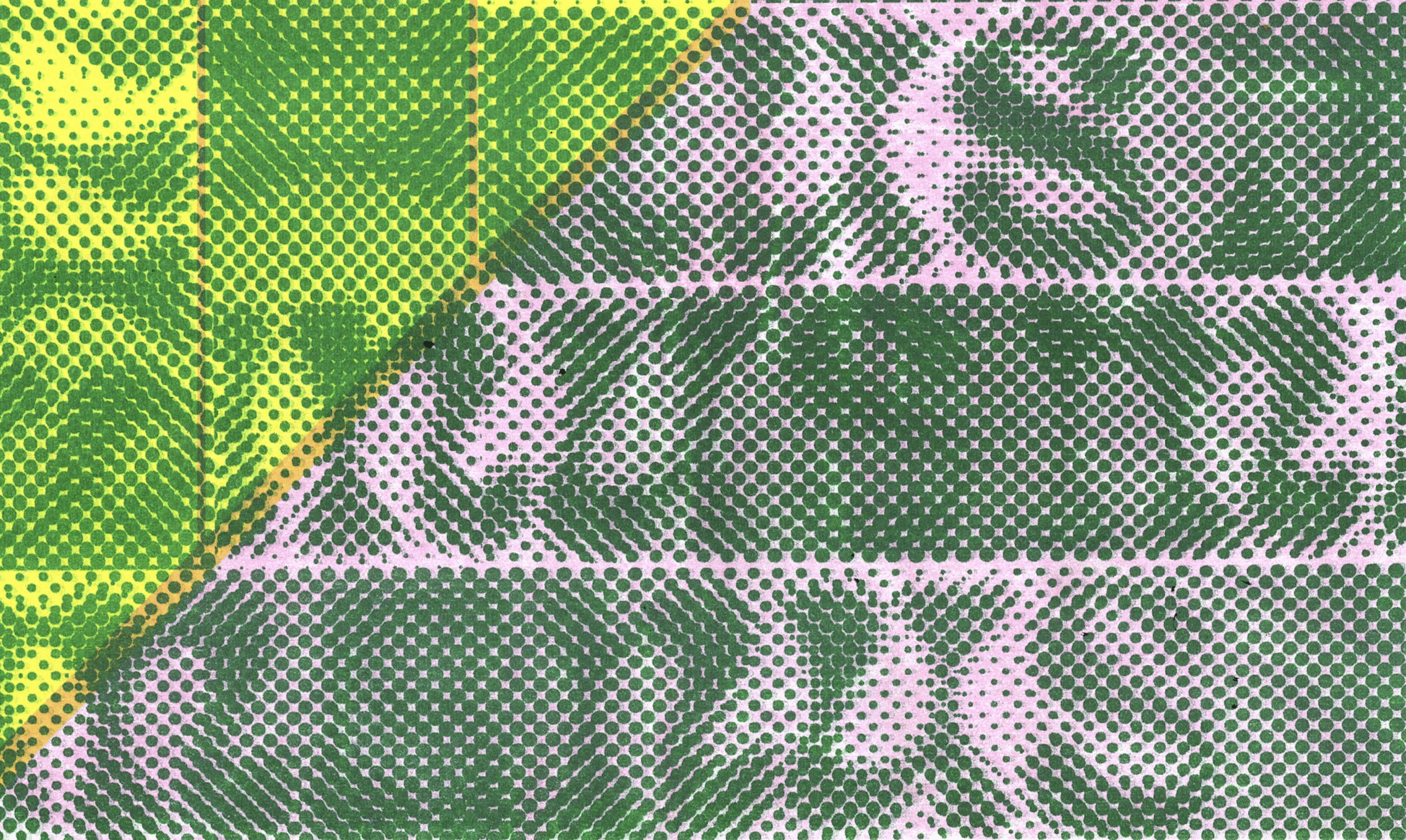
For this edition, we developed the cover using risograph printing, featuring the magazine’s signature experimental typography, ‘Eckmaanpsych.’ This typeface, characterized by its organic, bold shapes, ensures instant recognition for Manus magazine, even as it playfully challenges conventional readability. In addition to the print cover, we created motion design adaptations for social media and web platforms, expanding the magazine’s visual identity and increasing its reach online.
Result
The final design delivers a distinctive typographical cover that visually echoes the magazine’s organic, dynamic spirit. This approach not only strengthens the magazine’s brand identity but also resonates with the creative and educational network it represents. The motion design elements for digital platforms contributed to greater visibility and engagement within the local creative community.
Deliverables
Printed magazine — A4
Printed poster in risography in five colors
2x 45′ social media posts
Cover design — 1x 15′ motion design assets
in collaboration with →
Renate Coen
Annelien Vermeir
Maurice Staels